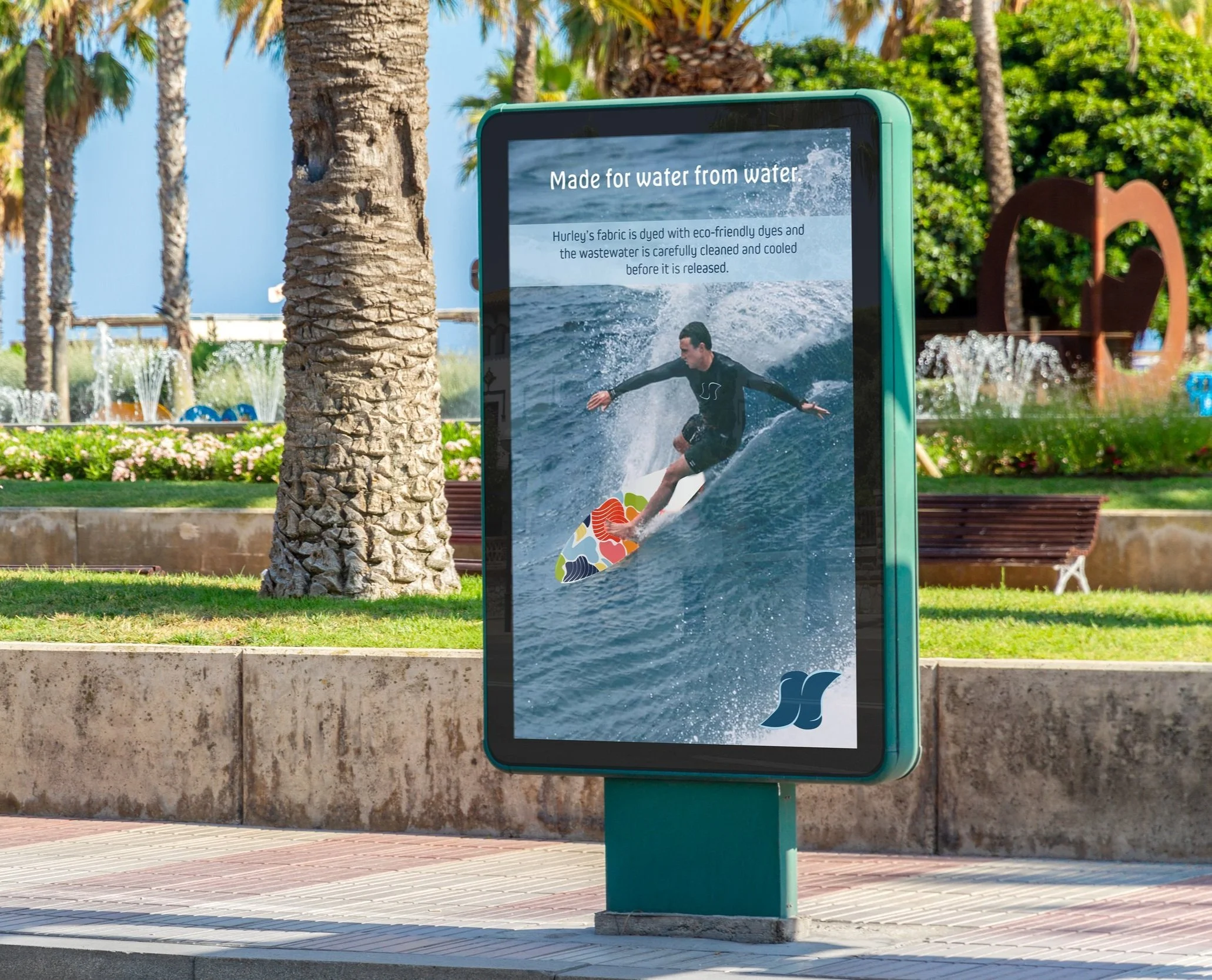
Come hang ten.

Hurley
rebrand | visual identity | retail system | school project
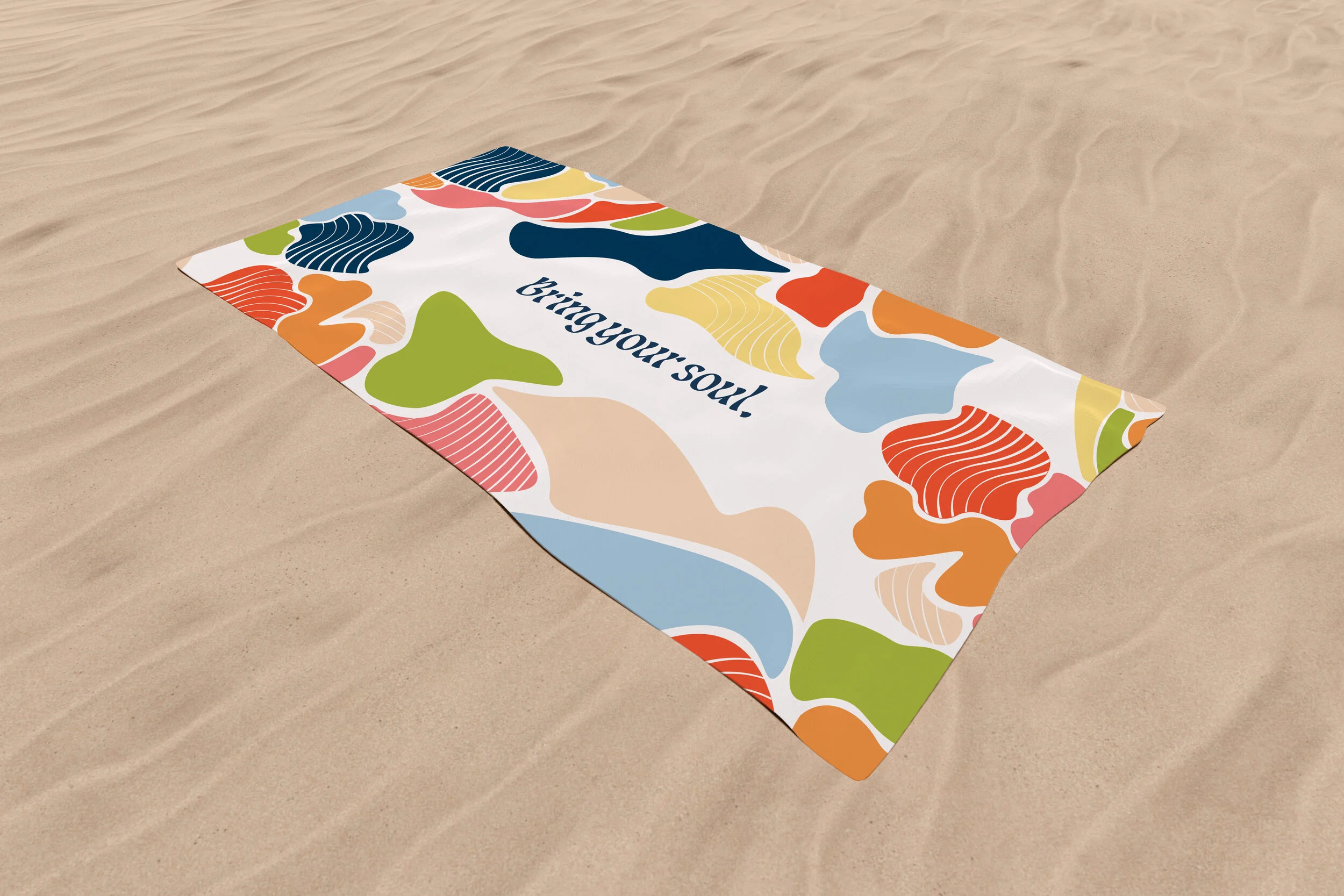
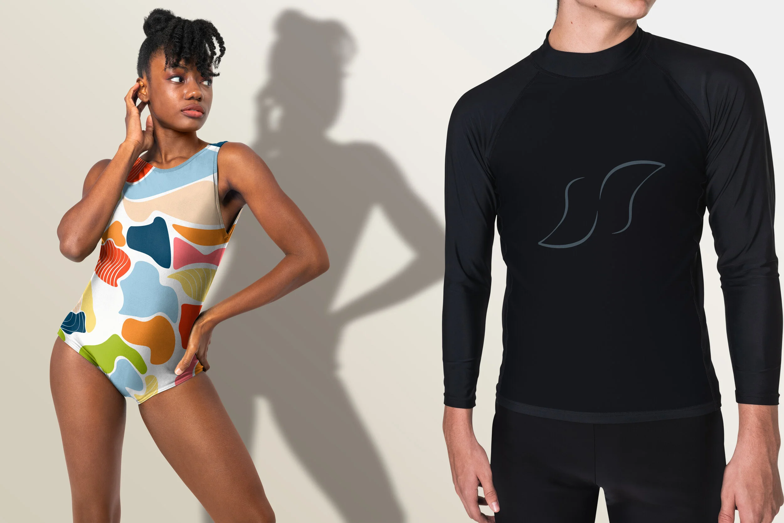
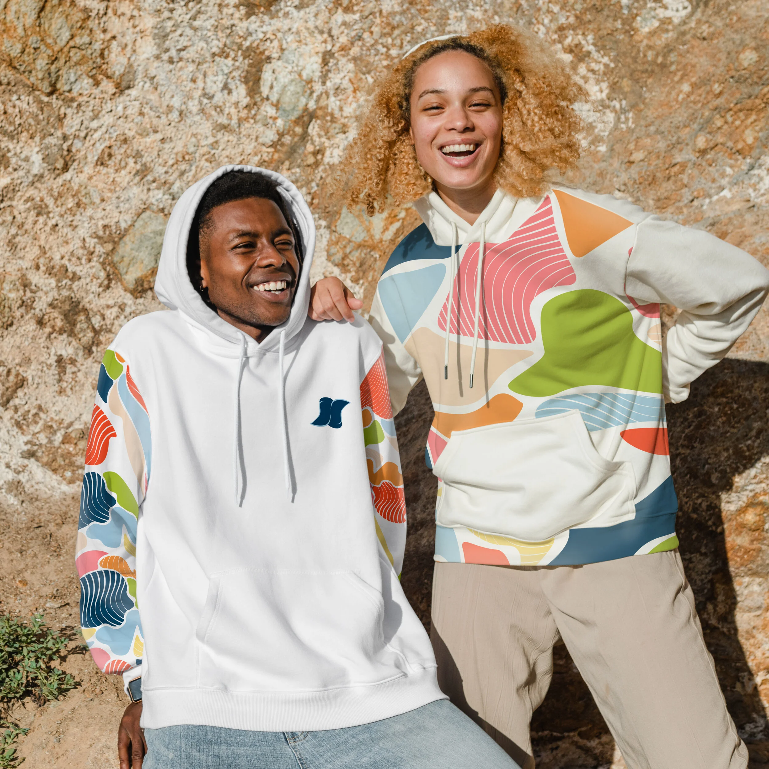
The new Hurley brand will expand UNISEX apparel, which is more inclusive of everyone. This fluid position makes a powerful statement as a company, being both socially conscious and bold. The logo and brand will better represent this fluidity, with it’s wavelike movement, gender neutral color palette, and a voice that speaks to everyone. The Hurley brand defines UNISEX as a spectrum, it’s not a certain gender… its someone’s soul in Hurley.

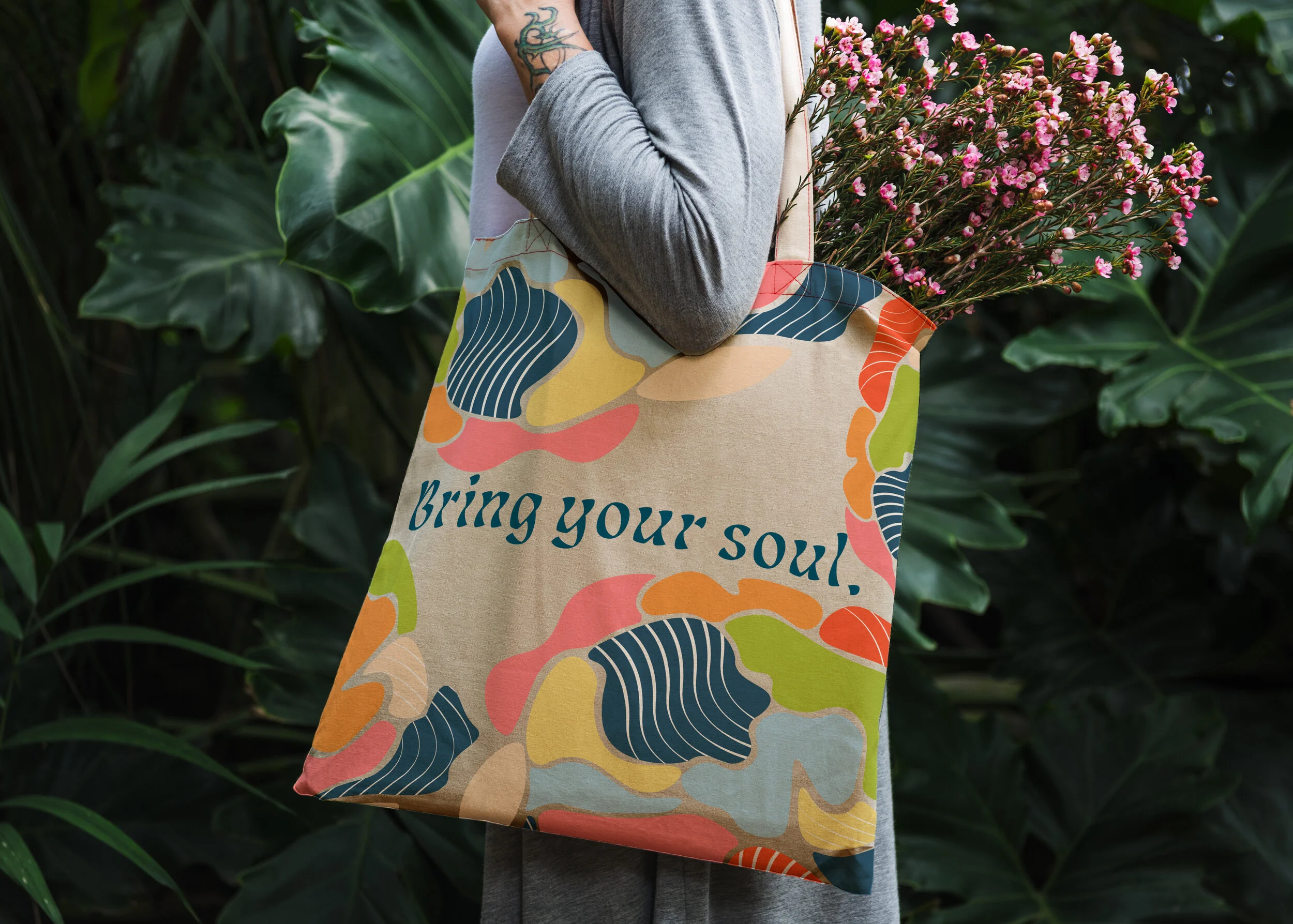
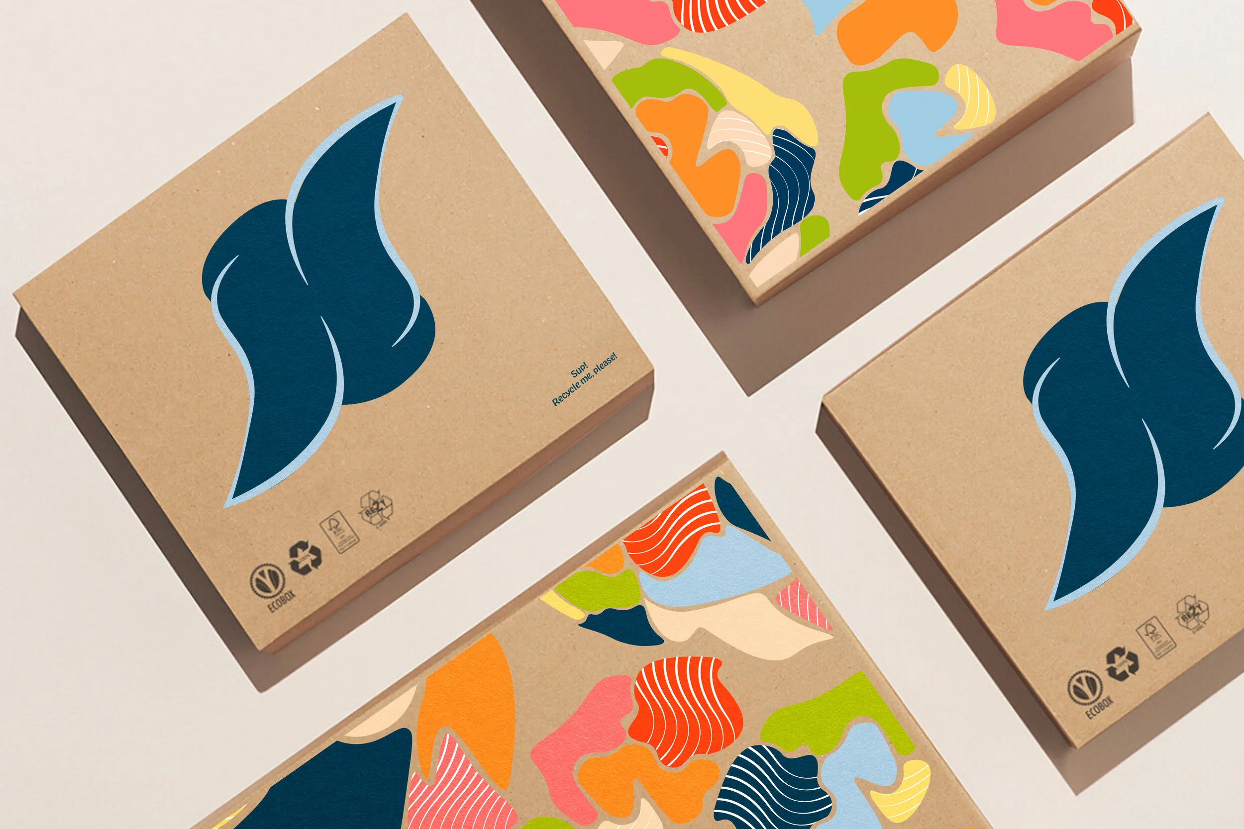
This pattern was develop to acknowledge the environment in which Hurley takes place. It symbolizes different parts of a whole, whether this is our unique consumers or the environment that the apparel lives in. The goal is to reflect nature and the beauty of it all. For consistent brand recognition, the lines originate from the Hurley logo mark.

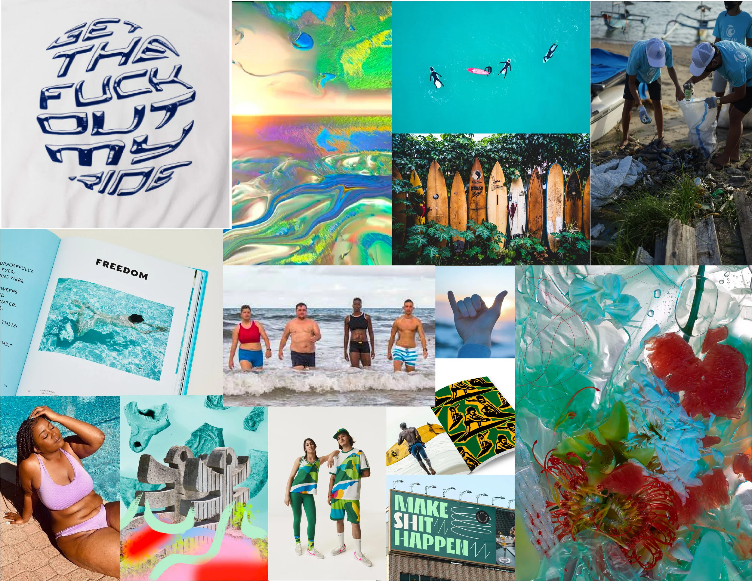
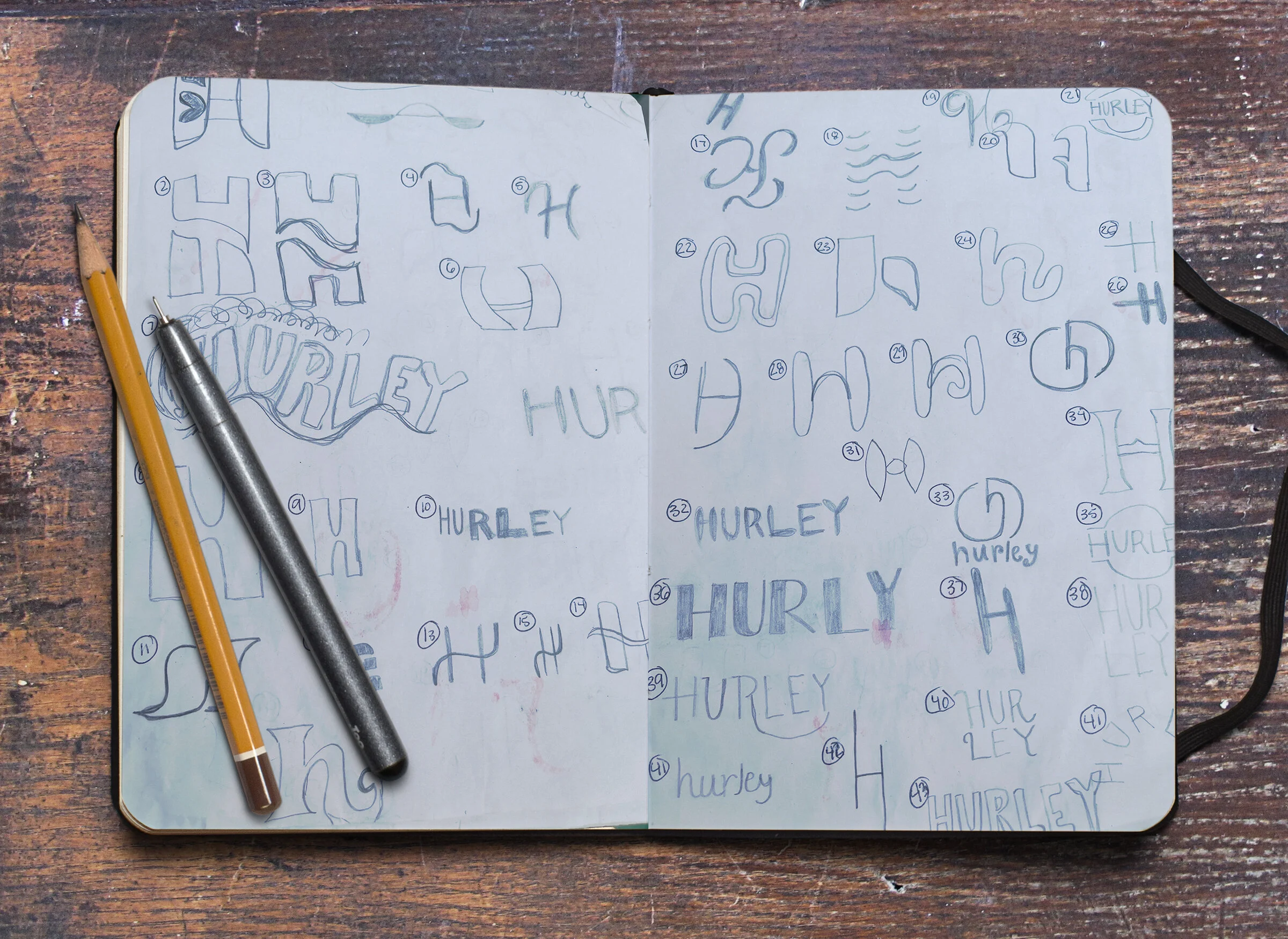
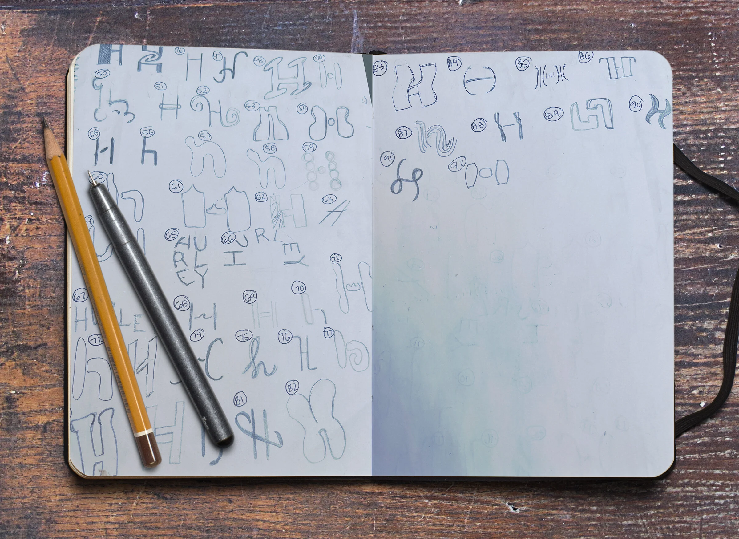
This project began with the exploration of an overall mood board and brandmark for the new Hurley.